This page might take a few seconds
to load, please wait.
Switch to Hicolor for the best viewing results.
I started to tweak the way, MVC windows are drawn. All this is a matter of taste. I happen to dislike the bright colored greenish look of the original browsers. So I provide this as an alternative. Currently, my code is just hacked into the system, destroying the original look. I plan however, to make it eventually a preferences setting so that you can switch between different looks.
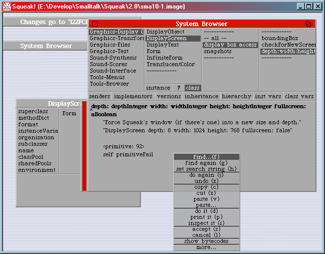
Below is a screenshot of my first try. All windows have an unicolor 3D look with bright red scrollbars and title bars. I added grayish-stripes for the background. Furthermore, I experimented with translucent menus.
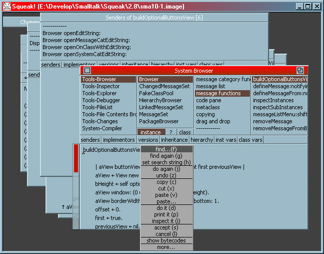
For this one, I changed the colors fitting my current desktop colors. I removed translucence for menus and also corrected the way optional toolbar buttons are drawn. Please notice the sans-serif font, Microsoft's Tahoma, which I prefer over Squeak's default font, NewYork.
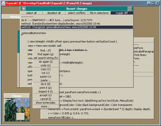
I also like the "Desert" look; again with a background with stripes. As I was still not satisfied with the look of popup menus, I tweaked them as shown in this screenshot. I enlarged the menu's line grid by two pixels which makes them easier to read. Then, I added the 3D separator lines and made menus the same color as windows and added a translucent drop shadow.
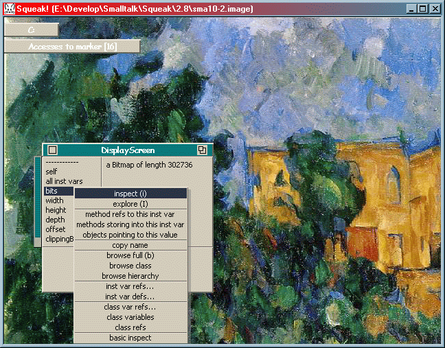
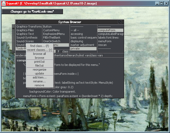
Actually, this color theme fits very well with this cool Cézanne painting as background. Unfortunately, it makes the GIF shown below quite large. I "borrowed" the image from the Web Museum of Paints. I also played around with the title bar and the scrollbar markers.
And last not but least, here's look with a onet background (le havre) with a darker low contrast look. BTW, both painting are actually 1024x768, so only the top left part is shown.
Last changed 2000-06-09 by sma